10 Most Common Website Design Mistakes And How to Fix Them

You know what they say —first impressions matter. And that applies to marketing, too! Visitors who discover your brand and want to know more about it are more likely to go elsewhere if they notice you made several website design mistakes when building your page.
But what exactly are these errors, and how can you fix them, anyway? Well, that’s what this piece is all about! Here, I’ll go over the 10 most common web design mistakes and how to get them right. If that wasn’t enough, I’ve also included examples of brands that do it right so you can see what good websites look like in practice.
Let’s jump right in!
10 Website Design Mistakes to Avoid at All Costs
I won’t keep you waiting, don’t worry 😉. Here are the most common mistakes found in websites and how to fix them:
1. Not Prioritizing User Experience
One of the most important characteristics of any website should be ease of navigation. Unfortunately, it’s becoming more and more common to prioritize aesthetics over a solid UX strategy.
I’ve seen it everywhere, especially as I research business pages: plenty of animations, stock video content as backgrounds, big and bold mottos that occupy half the screen… But no menu, CTAs, or informative content to be found.
It’s easy to get caught up on trends and want to add a myriad of elements that provide an immersive experience or simply make your page stand out. However, ignoring UX for the sake of an aesthetic look is one of the biggest website design mistakes you could make.
How to Get It Right
Merging user experience and innovative design isn’t impossible, you just need to find the perfect balance between ease of navigation and good looks. For example, check out Lacoste’s website:
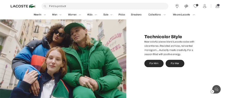
Their landing page is filled with video clips and images of the brand’s products. However, these elements don’t deter from the UX: on the contrary, they add to it, thanks to the clear CTAs that accompany each visual component, telling visitors exactly where they can find what they’re looking at.
Of course, this is an eCommerce website, so you might not have the opportunity to do something very similar to Lacoste if you’re in a different industry. But you can still implement a menu bar that clearly stands out from other features, and add a few CTAs that lead to the most important pages within your site.
2. Forgetting about Accessibility
Another common web design mistake is not taking accessibility into account. You might not give it a second thought while designing your site, but for people with visual or hearing impairments —or any other type of disability that hinders their navigation efforts—, accessibility is fundamental.
It’s not unusual to find websites with not enough contrast between the background colors and the text font, images with missing (or inaccurate) alt text, videos without subtitles, and/or unclear visual indicators on interactive buttons.
What’s more, an accessible website is more convenient for everyone: something as simple as adding subtitles to your video content makes it instantly more appealing since you’re removing the need to watch it with headphones on.
How to Get It Right
There are many ways you can fix this website design mistake without compromising your brand identity elements and overall look. Let’s examine Partake Food’s site to see how they did it:

The background and font colors are high-contrast, the design is simple yet very engaging and attractive, the copy is short and simple but informative, CTAs and menu buttons are clearly signaled, and you can easily navigate the page using a keyboard instead of a mouse.
But what truly stands out is the Accessibility Options menu on the bottom left corner. Visitors can change fonts to readable or dyslexic options, increase text and cursor size, hide images, and even stop animations, among other things. None of these options take away from the beauty of the site and its top-notch design, and they make it easily accessible for anyone.
3. Not Incorporating Negative Space
One of the most common website design mistakes you can make is trying to fit as much content as possible on a single page, resulting in a cluttered and overwhelming interface with no clear indicator of how you’re supposed to navigate it.
I know designing a site is exciting and you may want to include plenty of content, but it’s important to prioritize readability and use negative space to intuitively guide your visitor’s eyes from one element to the next without confusing them. This way, you can highlight what’s important and create a clean and organized look.
How to Do It Right
This fix is really easy. The difficult part is deciding which elements are the most essential and therefore should stand out visually, and which ones can be relegated to a different section of your site. Let’s look at Aegiq’s page for the perfect example:

The team decided to highlight their solutions and their applications, so their main page shows exactly that –nothing more and nothing less. However, a contrasting menu button on the top right corner lets users easily find out more about their Events, News, About, Careers, and Contact pages.
Aegiq brilliantly demonstrates you can achieve a clean and cohesive look without sacrificing any of your content —you just need to organize it into several sections and pages rather than cram it all together.
4. Using Weak CTAs
It doesn’t take a marketing expert to know the importance of CTAs. However, it does take a bit of skill to create a compelling one, place it correctly, and write a compelling copy to go with it so it doesn’t become a web design mistake.
Even if you have the greatest content ever, you won’t boost conversions with a CTA that’s hard to find, vague, or simply doesn’t highlight your value proposition. A plain ol’ “click here” won’t do the trick, so if you want a powerful CTA, you need to think about the two Ps —Placement and Prominence.
The CTAs should be placed both at the beginning and the end of a page, so they can entice visitors who already had their mind set on converting and also those who were still on the fence. Additionally, they should stand out from the rest of your copy.
How to Do It Right
If we visit Typeform’s page, it’d be hard to find this website design mistake. Let’s just take a look at their CTA “Get started–it’s free”:
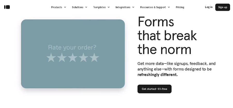
It’s clearly delimited by a contrasting color, right above the fold, catching the eye of any visitor. The CTA is also accompanied by a short text describing Typeform’s value proposition, emphasizing why they’re a better choice than the competition. Additionally, it says “It’s free”, and not just “Sign up” or “Get started” —effectively addressing potential concerns about costs and enticing people to click on it.
5. Ignoring SEO
SEO good practices go beyond acquiring backlinks and throwing a keyword here and there. In fact, design also plays an important role in your site’s ranking.
There are many little website design mistakes you can make that’ll impact your SEO negatively, like not using heading tags to organize your content into structured sections. Or using heading tags, but not selecting the keywords you want to rank for in them! And, speaking of keywords, not incorporating them into your URL is also harmful to your SEO efforts.
I could keep going, but one more thing you should always have in mind is that content is king. So even if your page is beautiful and has no web design mistakes, you need to add fresh content to it regularly to get a good ranking on the SERPs.
How to Do It Right
You don’t need to look much further than HubSpot’s main page to see what good SEO looks like in practice:
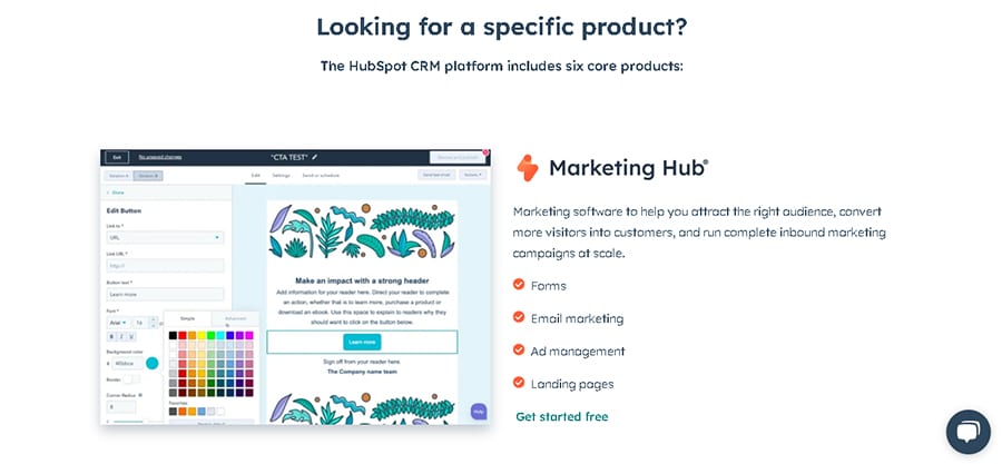
The copy is broken into different headings and subheadings, and there are many keywords, both normal and long-tail, seamlessly incorporated into it throughout the whole landing page.
Additionally, below every section, there’s a small yet noticeable CTA asking visitors to start their free trial. As people learn more about HubSpot’s offerings and engage with the CTA, their click-through rate increases, effectively aiding SEO efforts.
6. Not Fixing Broken Links
If you’re posting long-form content on your website, such as blog posts, chances are you’ve linked to external pages multiple times. But have you ever gone back to your old content to make sure those links are still working properly?
Even if you already know you don’t have any of these links, you should still check that all links within your website aren’t broken. It’s a tiresome task, I know, but neglecting it would be a website design mistake that hinders your page’s navigation.
How to Do It Right
Not to toot our own horn, but take a look at what we regularly do over at Yum Yum Videos’ blog:

Every blog post, no matter how old, gets regular updates to check for any broken links or outdated information. We’ve written hundreds of posts, so it’s not something you can get done in a day’s work, but it has to be done!
Here’s a pro tip: explicitly mention the update on the title, so visitors will instantly know that the information is new and can be trusted, enticing them to click on the post and read it.
7. Excluding Important Information
Time and time again I’ve visited an awesome business website while doing research and ended up finding out that it doesn’t have an “About Us” section, or their contact information is missing.
I know coming up with engaging and fun copy about your brand and your team may seem like a waste of time, but I can’t tell you how many times I’ve had to discard a company I wanted to do business with or hire services from simply because I couldn’t find anything about the team behind it. Or, even worse, I couldn’t find any information about their work and past projects!
Your site might look amazing, but it won’t drive conversions if it doesn’t provide visitors with what they’re looking for —and, ultimately, this is a big website design mistake.
How to Do It Right
In addition to details about your business and what you offer, you should always try to include a short section with FAQs or important instructions your clients should know before making a purchase.
For example, Propagandopolis, a website that sells vintage political prints, has a simple yet informative section about their shipping and products, including a size guide:
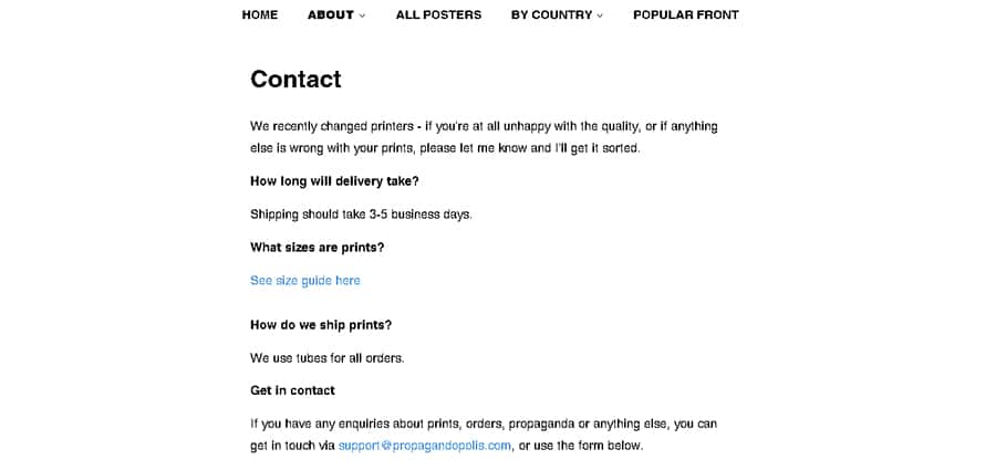
What’s more, there’s a form immediately below that section so people can easily get in contact with the owner. There’s no need for quirky copy or extensive paragraphs: short and sweet can work perfectly, as long as all relevant data is included.
8. Overlooking Brand Design
A big web design mistake that can seriously hinder your marketing efforts is not paying attention to your branding design elements, such as your characteristic fonts, color palettes, shapes, and anything that reminds people of your brand and increases their awareness and recall.
It might seem tempting to choose a modern aesthetic, filled with negative space and boasting a minimalist black-and-white design. Or maybe you just don’t want to bother with the hassle of creating branded color palettes and text fonts, so you’d rather go with a default design and be done with it.
However, tossing your proprietary image aside is a big mistake! All the aesthetic elements that are unique to your business have an effect on your clients’ minds, so it’s important to create websites that incorporate them. This way, you can also reinforce the image people associate with your brand.
How to Do It Right
Think of iconic brands, such as Tiffany or McDonald’s. Just seeing those characteristic colors on the street reminds you of them! This also happens with Starbucks and their distinctive shade of green, which they’ve incorporated into their official website:

Their characteristic deep green color is featured in the copy, and if you scroll down, you’ll find that every section is designed using that shade of green and other complementary colors that enhance it.
This way, they’ve achieved a beautiful layout with no website design mistakes, that subtly but effectively boosts brand awareness while using a varied color palette that doesn’t rely on a single shade.
9. Using Too Many Pop-Ups
You probably remember what the internet looked like at the beginning of the 2010s. No matter which website you visited, you’d be bombarded by a ton of ads in the form of pop-ups and even new windows would open on your browser. It was stressful, to say the least!
Of course, a current business website is quite different from those old ones. Nonetheless, that feeling of being overwhelmed by one pop-up after the other is equally annoying, no matter how benign that little window may be.
Using pop-ups sparingly isn’t a website design mistake, of course; but be mindful of the quantity and quality of them, as overdoing it can come off as spammy.
How to Do It Right
There are many brilliant pop-ups out there, but this one by Wild Souls is exceptionally great:

Usually, when you visit an eCommerce site for the first time, you’ll be offered a discount code if you sign up for the brand’s newsletter. This pop-up often occupies most of the screen and has the tiniest of closing buttons, leading to a frustrating user experience.
Instead of doing that, Wild Souls chose to incorporate a small, subtle pop-up that doesn’t interfere with navigation and only occupies one corner of the screen.
10. Not Optimizing for Mobile
Last but not least, we have the biggest website design mistake you could make right now: neglecting mobile optimization and only focusing on what your site looks like on desktops.
Just think about the number of times you’ve done an online search on your phone or tablet rather than on a computer. Many of your potential clients are doing the same, looking for the solutions your brand offers, but it’s up to you to provide a mobile-friendly website that lets them navigate it with ease.
On top of that, Google has implemented mobile-first indexing, which means that they’re prioritizing mobile-friendly sites to rank at the top of the SERPs over those that are desktop-only. In their own words, it’s not necessary, but highly recommended! So you can see why this would be such a big mistake…
How to Do It Right
If there’s one website out there that excels at mobile interfaces, that’s Wikipedia. Check this desktop example out:
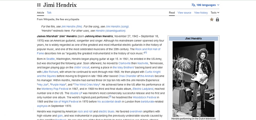
And now compare it with its mobile version:

The first thing that you notice is the change in font: the mobile version is more readable and perfect for a smaller screen. What’s more, the different CTAs, like download PDF or view source, are also bigger and have an icon next to them to be more noticeable.
As you can see, optimizing for mobile devices doesn’t mean your website design has to change completely. I highly recommend you research apps and software to test out how your mobile design behaves and looks in practice —there are some very good free options out there!
Wrapping Up
Well, that’s it for this piece! Now that you know more about the most common website design mistakes, I hope you’re scanning your page looking for what you can improve 😄.
In many cases, fixing a particular mistake can take some time and resources, so I understand not feeling up to it. Nonetheless, that mistake can be an obstacle between your business and a brand-new customer, so you must get going and start working hard to make your site as perfect as possible!
Hopefully, the examples I’ve included can serve as inspiration for you and get your creative juices flowing while you build or revamp your website. I’m sure you’ll do a great job!


