Table of Contents
20 Great Branding Design Examples to Get Inspired By
A well-done branding design creates a cohesive look throughout your business while accurately reflecting your brand values. But when thinking about it, people often get overwhelmed by the complexity of the process and all of the elements you must account for. However, it doesn’t have to be daunting at all!
I know that might sound hard to believe, so I’ve compiled a list of 20 great branding design examples that will help you understand how different designs can be applied to different industries and discover trends that can inspire your own.
Let me show you!
Main Elements of Your Brand Identity
Each brand is its own unique world, so it can be hard to pinpoint exactly which brand design elements should make it up. You probably won’t focus on mobile branding elements unless you’re a digital startup or company, for example.
Despite that, I wanted to explain the most basic elements any brand identity should design:
- Logo: Every logo design should always be clear and memorable in order to make the brand recognizable and distinctive.
- Color palette: Choosing a color palette of contrasting colors will make your text easier to read and help your brand create consistent designs. Moreover, your colors will be one of the most recognizable elements of your identity.
- Fonts: You can either create your own fonts or pick a few from the many, many options online. Your typography can say a lot about you and your company, but legibility should always be your top priority.
- Visuals: Visuals include all the elements such as images, shapes, and icons. They help communicate information in a simplified and easy-to-understand way.
- Style guide: Compiling all of your brand design elements into a style guide is crucial to ensuring they remain consistent. This is a useful tool to share with everyone on your team and make sure you’re all on the same page.
Branding design can also include websites, merchandise, menus, and even uniforms and offices. I know that all of this might sound a bit too abstract at the moment, but you’ll understand everything once we take a look at some examples.
Great Branding Design Examples
Now let’s dive into the fun part and analyze some of my favorite branding design examples!
Table of Contents
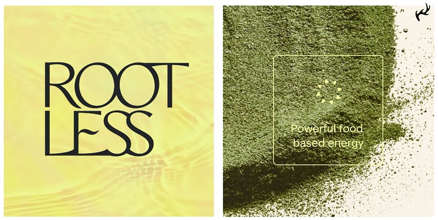
1. Rootless
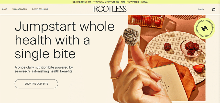
I’d like to start off this list with a branding design example that perfectly shows the power of having a good image to represent your brand.
Rootless is a company that produces seaweed-based products. Now, I know what you might be thinking, and you’d be right —making seaweed look appealing is nothing short of a challenge. But by choosing rich, warm colors and alluring textures coupled with professional art direction to reintroduce seaweed as a sophisticated, beneficial, and alluring product that can also be delicious.
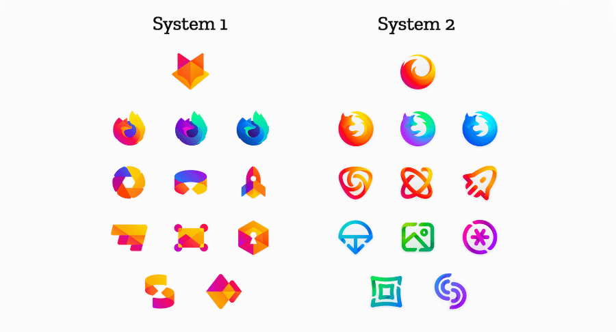
2. Mozilla Firefox
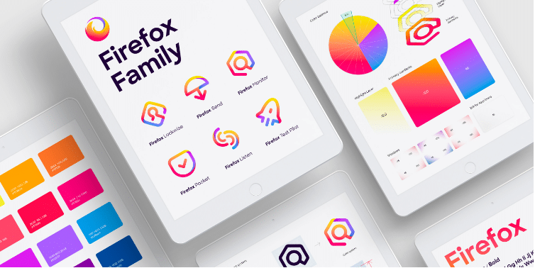
Mozilla was looking to create a master brand that would encompass all its products, such as the Mozilla Browser. So, they needed to redesign their entire identity while keeping the feeling of trust and reliability.
This posed a challenge, as the users were already familiar with their original identity. That’s why they decided to ask the community for feedback! This was a great move on the company’s part because brand identity is all about being easily recognized by the audience, after all.
3. Folks
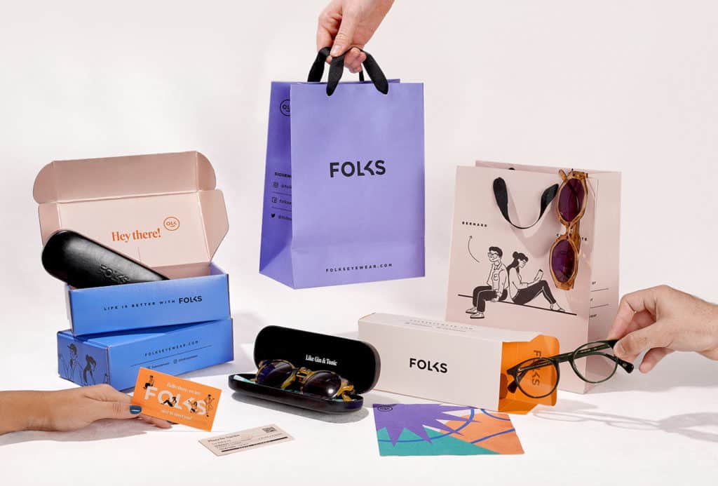
Here we have another branding design example that involves creating an entirely new identity. In this case, it wasn’t because the brand was adding new products but rather because the old design wasn’t resonating with the target audience anymore. Even the name was changed!
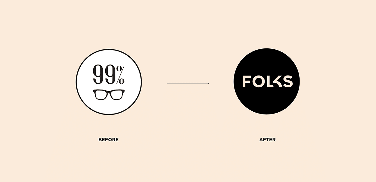
The reasoning for the new brand name was that eyewear is an intrinsic part of their users’ lives, almost like a best friend. The company believed that “eyewear can become one’s pal,” so they went with “Folks.” Of course, every other element of their branding was also renovated, but this goes to show that a new look, while scary and challenging, can be your saving grace.
4. Ecoscience Foundation
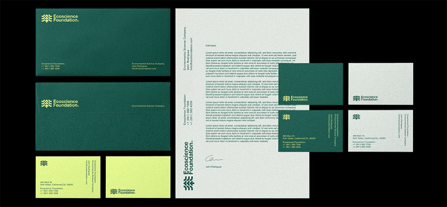
The Ecoscience Foundation is a startup company looking to protect nature and the through innovative technologies and scientific research. The company needed an identity that gave them consistency across all of its brand applications to make it come across as dependable and reliable.
To do that, Jawad Zelmadi created a logo and a color palette that resonated with the brand’s mission and objectives, taking inspiration from nature.
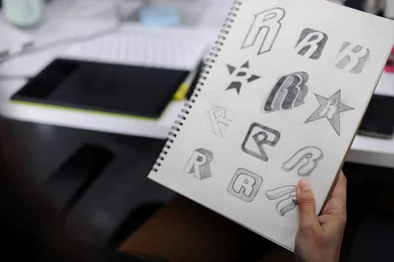
5. Yum Yum Digital
![]()
Something important to keep in mind when choosing your logo’s design is how well it will look when shrunk down to, for example, use it as your website’s favicon. That’s why it’s always recommended to stick to one or two contrasting colors and a design that can be easily simplified.
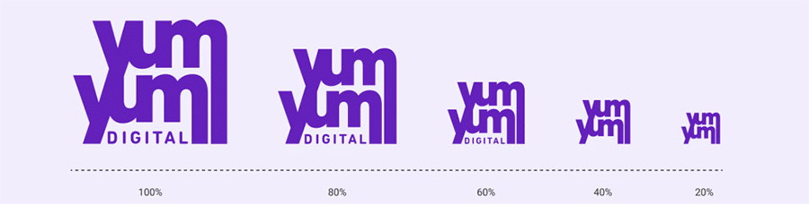
If you consider our own logo, for example, you’ll see that when shrunk down to favicon size, the word “digital” gets removed. But even with that removal, it’s still easily recognizable.
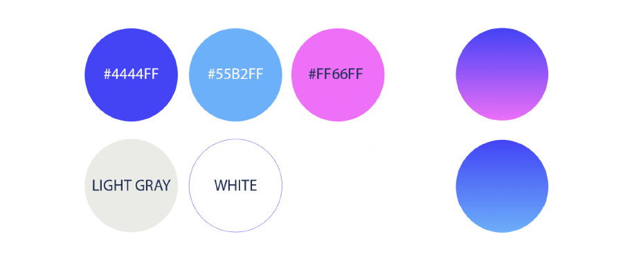
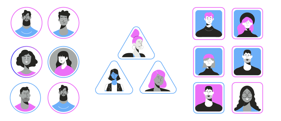
6. NorthPeak Pay
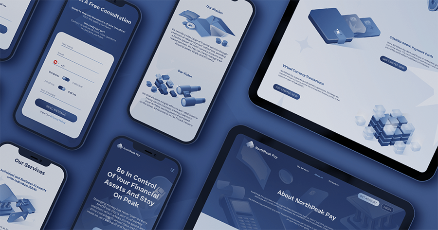
Illustrations are also a bit part of a company’s branding design. As such, they have to be in harmony with all the other elements, including the typography and the logo. The best way to ensure that is, first, by sticking to the same color palette or choosing a complementary one at least.
Then, you have to use the same style as your logo. This part might sound more challenging, but it basically means that if you’ve been using curved and little detail, as is the case with NorthPeak Pay, then your illustrations have to be the same.

7. Accelerant
Accelerant is a cutting-edge, responsive insurance program carrier looking to revolutionize the industry. They wanted to create a video that could better explain what the company does and how they do it, so they entrusted the project to Yum Yum Videos.
Since it already had a brand identity, the new piece of content had to match it. That’s why the same color palette was used in the characters and other animated elements.
The resulting asset fully matches the brand’s modern aesthetic while conveying its dependability and keeping the content engaging. Moreover, the company’s logo is also present throughout the entire video to reinforce brand association and recognition.
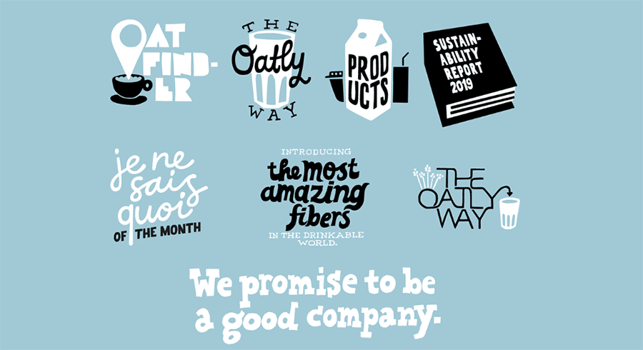
8. Oatly
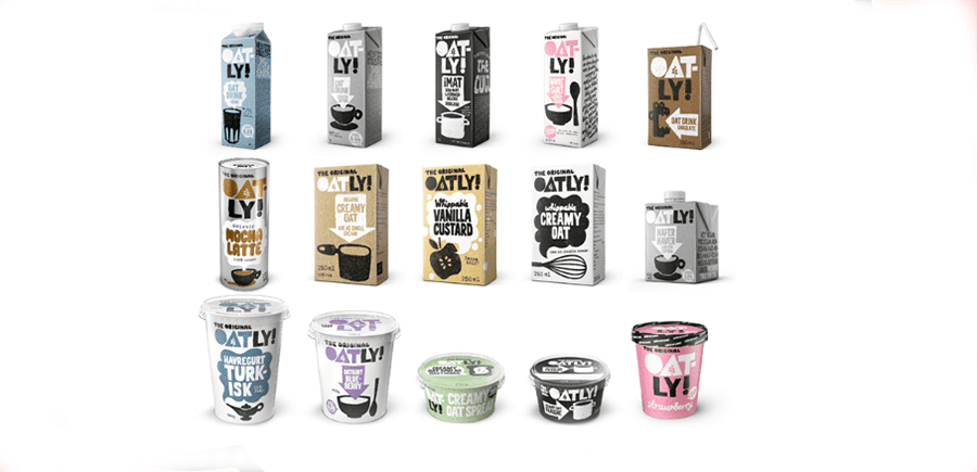
Oatly is a company leading the charge for dairy alternative products with its oat-based beverages. Two of the brand’s main core values include making the food industry a more honest one, and emphasizing that Oatly isn’t a perfect company, but that it has good intentions.
In this branding design example by Emily Mellem, those values are clearly reflected in the choice of bold fonts and illustrations. The handwritten look of the fonts and the eye-catching thick lines of the images convey the brand’s daring ambitions.
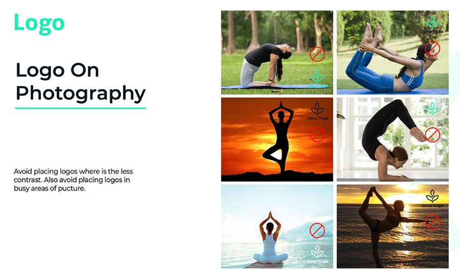
9. Jano Yoga
Remember I mentioned at the very beginning that having a brand guide compiling all of your branding guidelines in one place was important? Well, here you can see why.
Instructions on how to use the different branding elements are crucial to reaching their maximum potential. Their effective implementation depends on getting everyone on your team on the same page and letting them know the best practices regarding each and every brand element, including examples of how not to use them.
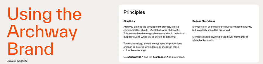
10. Archway
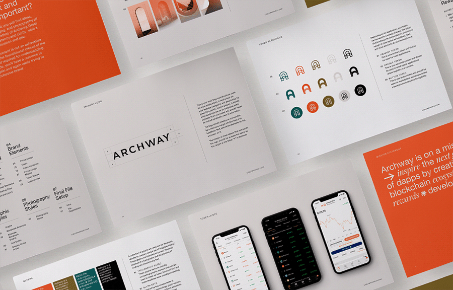
Archway is a platform that developers can use to easily build decentralized apps using blockchain technology. Simplicity is key to this product, and the company wanted to apply this principle to its branding in a way that could also accurately represent the world of possibilities that the product offers.
Ludlow Kingsley decided to go for a vibrant color palette only limited to four colors and combined it with a balanced typography and unique glyph elements. This way, the compelling visual identity effectively conveys the company’s sense of originality and innovation as well as its simplicity.
11. ICC Immersion
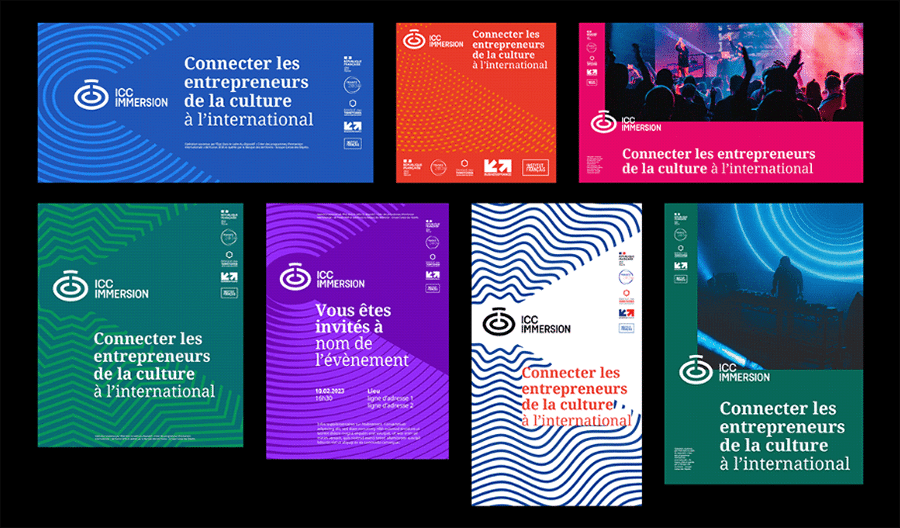
Patterns are often disregarded when it comes to branding design, but they can definitely enhance your visuals —when used right, of course. Graphéine’s created a series of patterns featuring seismic waves spreading out and drawing a big C that surrounds the logo.
This way, they gave a sense of dynamism while reflecting the brand’s mission of accompanying and developing the creative and cultural industries. Pretty neat for “just some patterns,” don’t you think?
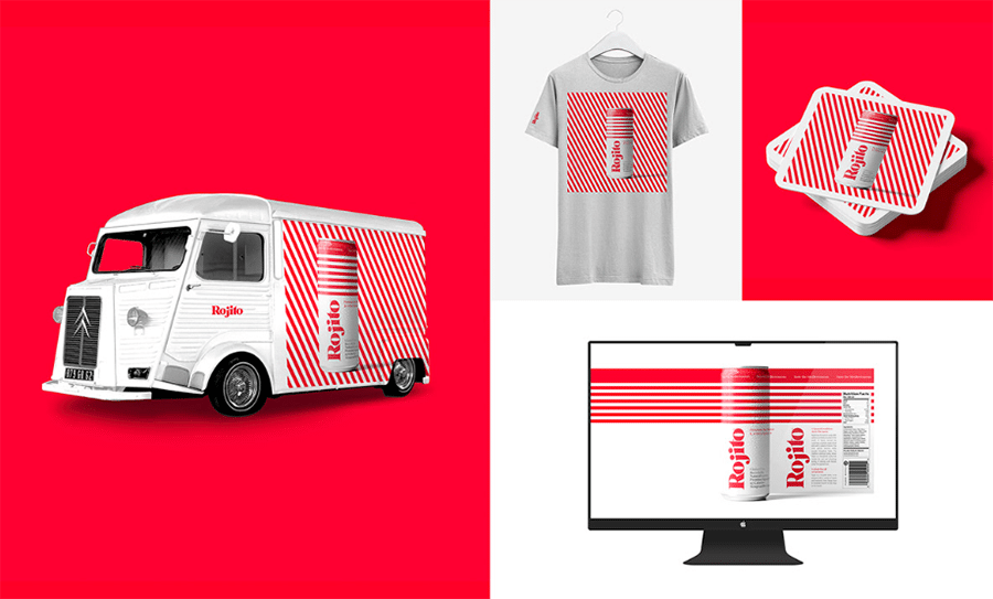
12. Rojito
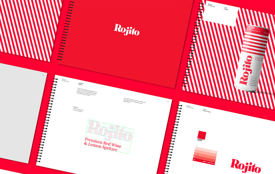
“Rojito” (reddish, in Spanish) is the household name for a spritzer made of red wine and a splash of lemon. This product, according to the company, “evokes the cool and refreshing feeling of relaxing with friends.” As such, their branding design sought to reflect that feeling.
The tricky part of such minimalistic design is how to translate it across multiple media and products, and still look good and visually appealing. I think this is a great branding design example of how to succeed in doing that, don’t you agree?
13. Skinspace
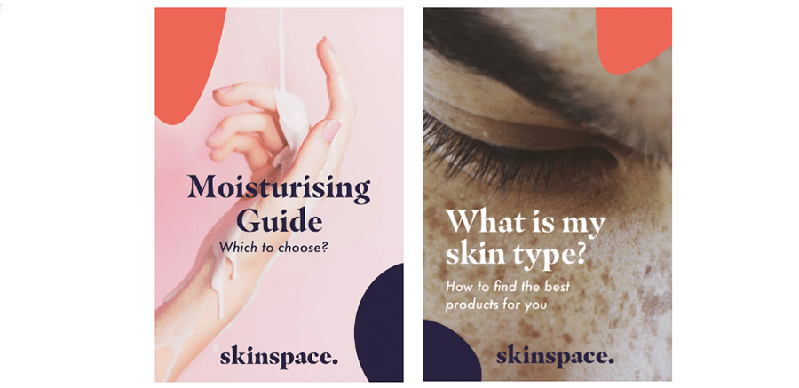
Skinspace is a website that brings the most trendy skincare brands together in one place, but it also shares awesome content for users on social media. Since users find themselves bombarded with content online, it’s important to brand your company’s in order to stand out from the rest.
Something as simple as using the brand’s fonts, typography and a few shapes, as it’s been done in this branding design example, can do wonders!
14. Wartdrobe
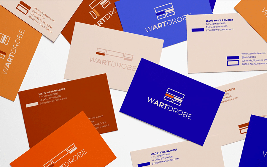
Wardrobe, a brand specializing in fully customizable modular wardrobes, was looking to establish itself when it was taking its first steps as a startup. That’s why I’ve chosen this case as an example of how to create a branding design from scratch.
Gaby Klein took the concept of modularity and the structure of the wardrobes to come up with a unique logo for Wardrobe and reflect its versatility.
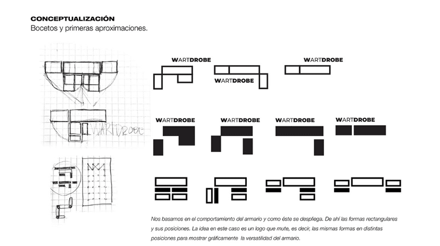
This goes to show that you don’t need something overly complex to accurately represent your brand. Just see how something as simple as rectangular shapes and straight lines gets the job done perfectly.
15. Pinpoint
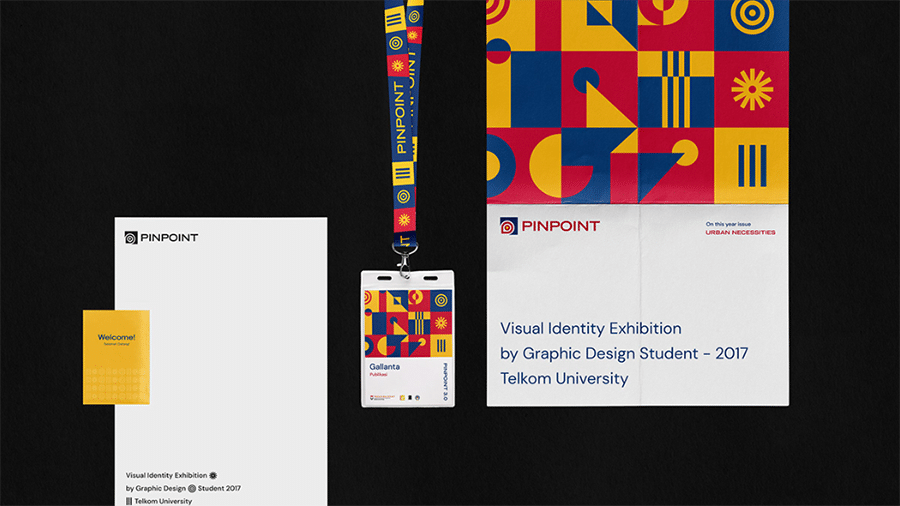
Branding design is not only limited to business —just take Pinpoint, for example. It’s an annual exhibition held by graphic design students of Telkom University that has branded all of their content and merchandise.
That year’s exhibition was about urban necessities, so the design team came up with a creative solution based on modern society and innovation.

Moreover, the use of modern-vintage style colors mixed with colorful geometric shapes resulted in a unique identity that caught the eye of anyone who came across one of their signs or posts.
16. Spotify Wrapped
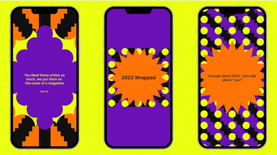
We’re all familiar with Spotify’s traditional color palette. The Spotify Green combined with neutral colors such as black, white, and gray, have become instantly recognizable. However, Spotify Wrapped, the feature that summarizes your listening habits throughout the year, boasts an incredibly dramatic color change.
The company says it decided to embrace a more colorful language to convey how music culture has always been a diverse and colorful phenomenon. But whatever the reason is, there’s no denying that the strange combination of almost neon-like colors is different and eye-catching.
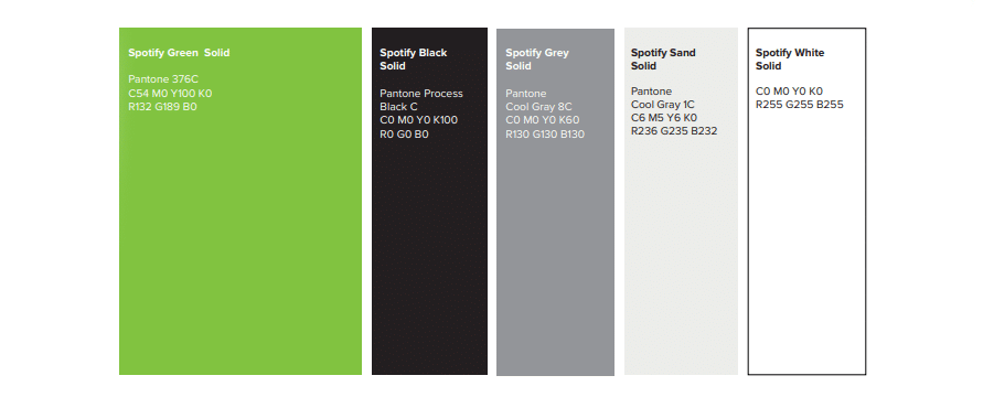
This shows that branding design can sometimes be tweaked to more accurately match a product’s feeling and aesthetic, even if it has to deviate a little (or even a lot!) from what you’ve been doing so far.
17. Iterable
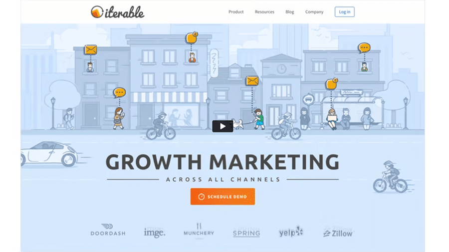
When you’re taking your first steps into the business world, you might not yet have enough budget or resources to create a branding design that’s able to rival that of big companies… Or so you might think!
The truth is that you don’t really need fancy fonts or a highly complex logo to give your brand a more professional look and stand out. Just take a look at this example — Iterable uses two very common fonts called “Ubuntu” and “Source Sans Pro.”
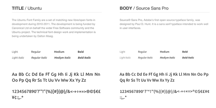
While both of these fonts are available for free on Google Fonts, no one can deny that their website looks fantastic!
18. FLYR
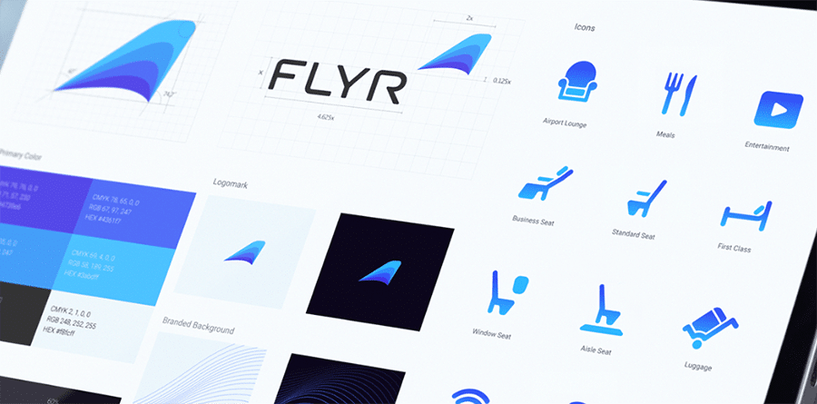
FLYR is a platform that leverages the power of AI to enhance and personalize airline offerings. The company was looking to take its branding design to the next level and evolve and refresh the brand. However, anything that had already become familiar to users had to be treated carefully to maintain brand recognition.
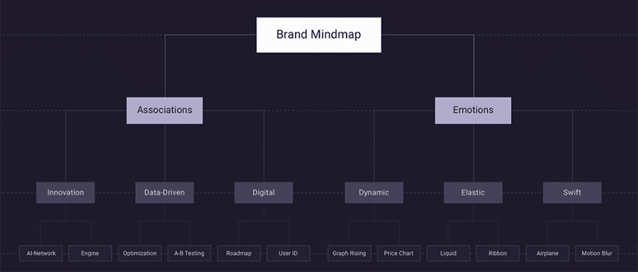
So, the team at Ramotion worked on a mind map of associated terms and emotions that were representative of the business’ look and feel. Thanks to this, they were able to come up with a new, fresh and modern design while keeping the essence of the company.
19. Hibex
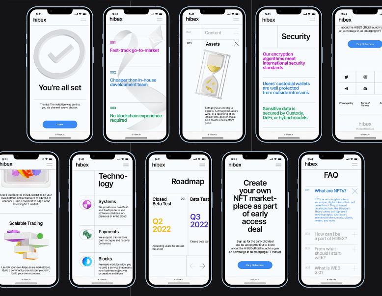
Minimalism is all the rage in branding design lately. The thing is that most people believe that it translates into a boring color palette of one or two neutral colors and a boring logo of simple lines —and that couldn’t be further from the truth!
Just look at how Hibex uses more than two colors, and highly saturated ones on top of that, and still keeps the design minimalistic. The secret to successfully implementing this lies in avoiding busy backgrounds, sticking to a playing white or black one, and opting for a bold or thick typography that makes the text legible regardless of the color.
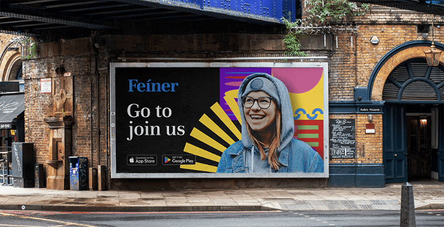
20. Feíner
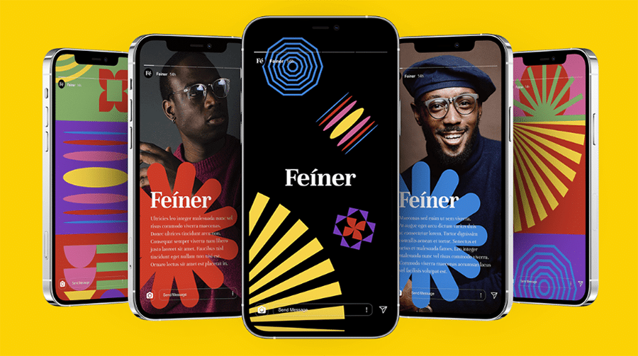
I’ve mentioned before that minimalism is a highly popular trend in branding design, but this doesn’t mean you have to follow it if it doesn’t suit your image. In fact, doing the opposite might be even better to help your brand stand out.
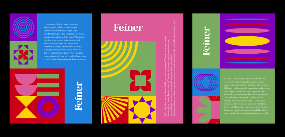
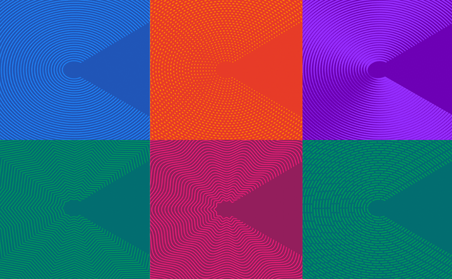
For example, Feíner, a platform where creativity is shared and inspired, features two corporate patterns and six bright colors to convey the ideas of creativity and creativity. On top of that, said patterns and colors can be combined in a great number of ways for different purposes and assets.
How Yum Yum Digital Can Help You
I hope you’ve been taking note of all of your favorite elements in these examples! Once you’ve figured out what will work for your business, you could start thinking about entrusting the project to a brand design company.
Here, at Yum Yum Digital, we take the time to discover exactly what your brand needs to convey your personality and values based on the branding inspiration and any relevant details you share with us.
We pay close attention to detail to ensure everything is perfect and that you’re not only satisfied with your design, but also excited to share it with the world!
If this sounds like something you’re interested in, drop us a message! We’d be happy to hear all of your ideas 😄.
Wrapping Up
Well, we’ve reached the end! I hope these wonderful examples have sparked some ideas for your own branding design. Getting the creative juices flowing is the first (and probably the most) important step of the process 😉.
Once you’re ready, it’s just a matter of figuring out how to best represent your brand’s identity, your mission, and your values. And should you need it, you can always enlist professional help to bring your ideas to life!

