Table of Contents
Healthcare Website Design: The Top 10 Examples of 2023

If you’re reading this, you’re probably aware of how crucial it is for medical professionals to establish a solid online presence to improve trust in you and your practice. Having a website is a big part of that, but it’s not as easy as just creating one: you must put in some work in the beginning, including learning about healthcare website design and its intricacies.
However, I know that web design is no child’s play! That’s why I’ve compiled 10 great examples of healthcare websites that’ll inspire you and give you some excellent ideas to implement on your own page.
Keep reading to learn more about this essential part of your digital marketing efforts 😉.
Table of Contents
Why Is Healthcare Website Design Important?
According to the latest statistics, 68% of online experiences begin with a search engine. So, it’s not hard to imagine what that means for healthcare professionals… Your patients are probably out there already searching the internet for a solution to their medical needs!
That’s why having your own website is paramount to reaching your prospective (and even current!) patients. They’re actively looking online for healthcare services, but you need to have something set in place for them to find you and get in contact.
That’s not all, however. The design aspect of your page is a crucial factor when it comes to catching their attention and increasing their trust in you. Just think about it, a shady website with absolutely no cohesion within its different sections, CTAs that lead nowhere, and a lack of informative content… Who would even bother contacting that site’s owner?
Don’t panic, though! Once you get the hang of it, it’s not as daunting as it might sound 😉.
The Best 10 Examples of Healthcare Websites
The best way to learn how to do something new is by watching the pros in action. So, just read on and discover how healthcare website design is done.
1. Illinois Dermatology Institute – Introduce Yourself
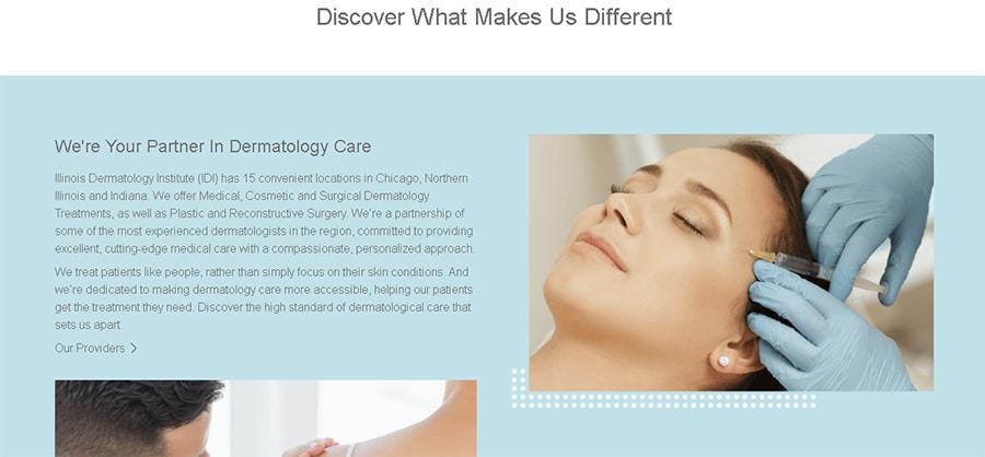
Since health issues can be a really vulnerable topic to deal with, prospective patients want to find a professional they can rely on even when they’re at their lowest point. They need to know they’ve chosen the best expert available to help them.
The Illinois Dermatology Institute has a dedicated section on its main page explaining its unique approach to medical care, emphasizing that in the eyes of this passionate team, patients are more than just their skin conditions. Moreover, they emphasize that they want dermatology care to be more accessible to everyone.
Statements such as this, highlighting your vision and mission and focusing on how much you care about the people coming through your doors, are what set you apart from others, and something that should definitely be part of your healthcare web design.
2. Thermo Fisher – Feature Success Stories
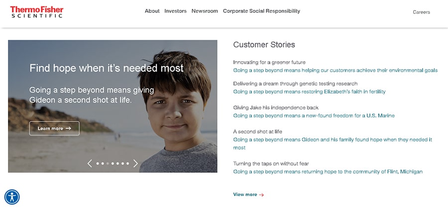
One of the most important goals to achieve when it comes to healthcare marketing is to remove all potential fears your patients may have. Visiting a doctor’s office can be scary enough on its own, so it’s crucial to show your prospects that past visitors have had a nice experience with you.
In the case of Thermo Fisher, they’ve included a section in their site that’s solely dedicated to past patients and their success stories, along with stories of communities they’ve helped, like Flint, Michigan. What’s more, each story title begins with their slogan, “Going a step beyond,” subtly but effectively serving their branding efforts.
Having a similar section as part of your healthcare website design is a great way to let your visitors get to know you and your work ethic through the real-life, positive experiences of other people.
3. Mayo Clinic – Provide Helpful Information
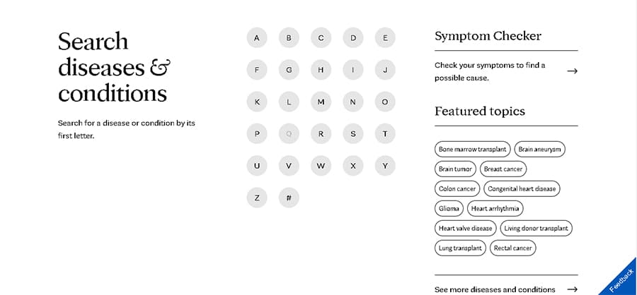
You’re probably acquainted with the many memes about asking Google for an explanation of a simple headache and being diagnosed with a terminal disease. There’s plenty of misinformation going around the internet when it comes to healthcare, so it’s important to provide an authoritative place where people can look for real answers.
The Mayo Clinic went above and beyond in this respect for its healthcare web design, creating an index where you can search for diseases and conditions by their initials, along with a symptom checker.
Of course, you don’t need to include such a complex searcher on your own site, but having a dedicated section where you provide helpful information about your specialty and the common symptoms patients may have can be very beneficial.
4. National Jewish Health – Make Navigation Easy
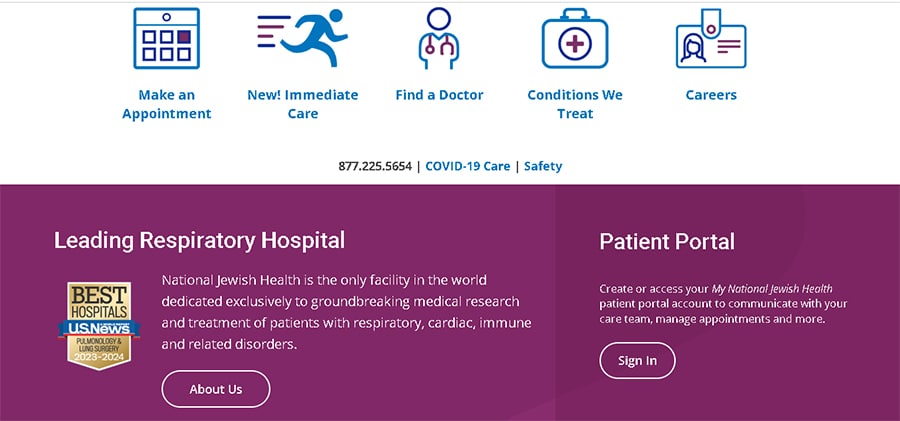
User experience is another must-have feature for your medical website design. In fact, it should be as easy to navigate as possible! So, prioritize setting up internal links that lead to the most frequently visited elements of your page, such as a page to make appointments, an About Us section, and the patient portal.
National Jewish Health’s landing page is very intuitive —it has a few different icons leading to the most used features of their site, even including a Careers icon for people who want to work at their hospital. Additionally, their phone number and COVID-19 guidelines are easily accessible too.
If you’re an independent professional or work for a smaller practice, you may not have so much information to provide, but be sure to at least include the basics I mentioned above.
5. CHECT – Leverage Color Psychology
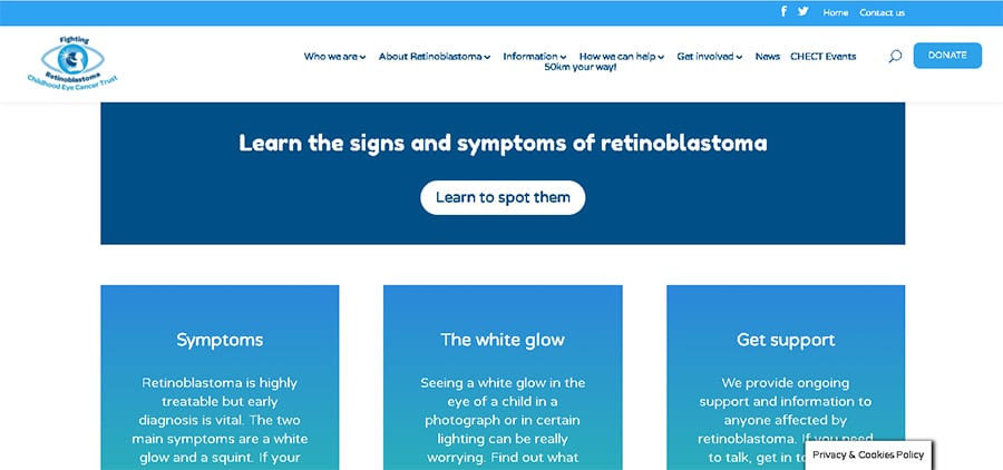
Yes, people, color psychology is not only real but also a very important element of healthcare website design. Different colors convey different meanings: green, for example, is closely associated with health and nature, while brown reminds us of seriousness and wisdom.
In the case of the Childhood Eye Cancer Trust’s site, you’ll notice immediately how different shades of blue dominate the visual landscape. This isn’t surprising, as blue is the most widely used color in the industry because it’s intrinsically linked with the notions of credibility, knowledge, and calm.
Of course, using blue isn’t a requirement! You may use almost any color you like, as long as you’re aware of the potential unconscious effects they can have on your prospects.
6. McKesson – Try Out Video Content
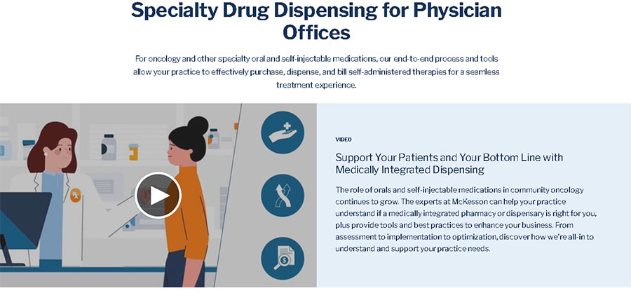
Oftentimes, you’ll need to explain very complex topics to your audience, and this can be made twice as difficult if you try to convey them through written text alone in your healthcare website design. That’s why video content has become a staple for healthcare websites, allowing you to deliver your message effortlessly.
The McKesson team has a number of video pieces under their belt, from whiteboard animations to animated explainers. With so much important information to communicate, the use of video is an amazing tool to condense it all into a more easy-to-digest format for their audience.
And animated explainers and whiteboard videos aren’t the only styles you can choose from! Testimonials from prior patients and product videos for new product launches are also very popular in the industry.
7. Mercy Health – Include Chatbots
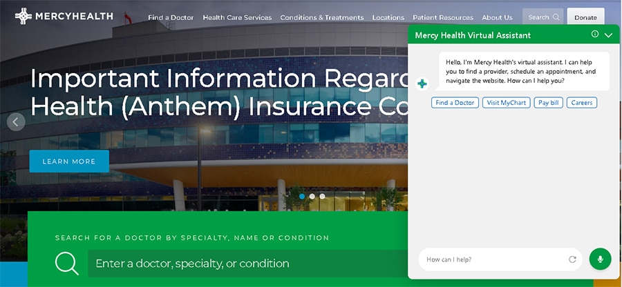
You’re probably already familiar with chatbots, as they’re a staple of most websites. Nonetheless, as I did my research for this article, I realized that many healthcare web designs don’t take chatbots into account.
This digital marketing tool can be a very valuable asset for your customer experience by offering personalized solutions to your page visitors 24/7. In the case of Mercy Health, their chatbot can help with finding a provider, visiting the patient portal, paying a bill, and looking for job offers —undoubtedly the most visited sections of their site.
You can customize your chatbot to your and your patients’ needs, such as scheduling appointments, finding a location, or anything else that’ll make their visit to your website easier and more efficient.
8. Carolina Vein – Take Accessibility into Account
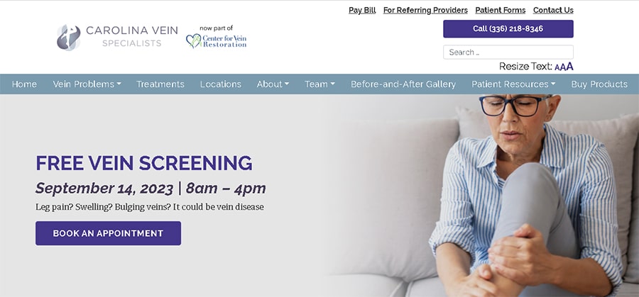
Accessibility should be at the top of the priority list before launching healthcare websites (and any website, really). However, more often than not, it’s something that gets easily tossed aside and forgotten about.
But look at Carolina Vein’s landing page: It uses large, high-contrast fonts, and right at the top, we have the option to resize the text and make it larger. What’s more, their images have alt text, which can be read by screen readers and similar software for people with sight impairments.
In addition to font size and color and alt text for images, you should also take into account that links need to be visually identifiable by making them distinct from the standard copy, and that any video content should have subtitles.
9. Astera Cancer Care – Implement Branding Strategies
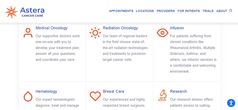
Having a robust brand identity set in place is a very important feature of healthcare website design. This will make you and your services easily recognizable to both prospective and current patients, and promote awareness of your practice.
Take a look at Astera’s website: they’ve chosen orange and blue as their characteristic brand colors, so they use them in all design assets to create a cohesive and memorable look. Additionally, if you check out their social media pages, you’ll also find these colors in all of their posts.
Making it easier for your audience to recognize you is key to establishing a presence in their minds and making them think of your services when they need a medical solution, so you definitely need to apply those principles to your site.
10. Pavillon – Make Getting in Touch Easy
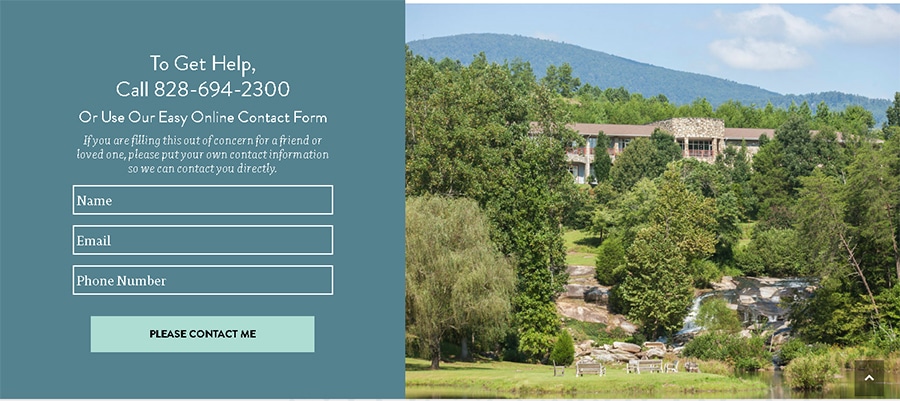
Even if someone visits your page and is interested in what you offer, there’s no guarantee that they’ll contact you right away. However, you still need to make your contact information abundantly clear and easy to find!
On that line, I highly encourage you to follow Pavillon’s example of healthcare website design. Not only does their page feature their phone number, but also an online contact form where people can get in touch through email instead of only by phone. Not everyone is comfortable with such a direct interaction, so they might find it easier to speak through a written medium first.
While you may not have the time to get in touch with prospective patients instead of the other way around, you can still leave your email address so they can shoot you a quick message.
Wrapping Up
That’s it for now! I hope I got the creative juices flowing with these cool examples of healthcare website design 😄.
Setting up and maintaining your own site is super important in today’s online world, so both prospective and current patients can get in contact with you and learn more about the services you provide.
Now that you’ve seen some healthcare websites with awesome design features, you’re ready to follow their lead and start brainstorming what you want for your own page. I’m sure it’ll look fantastic!

