Table of Contents
Quick Guide on How to Tackle YouTube Banner Size and Dimensions in 2024

As the second-largest search engine in the world, YouTube is more than just a platform to share your videos. It’s actually the perfect place to get your business discovered and loved by hundreds of people who perhaps wouldn’t have heard of it otherwise! As such, your branding efforts must be on their A-game —from your thumbnails and logo to your YouTube banner size and overall look.
In this short yet insightful piece, I’ll delve into the ideal dimensions of YouTube banners so yours can look great on all devices, as well as give some examples of what awesome channel art looks like.
Let’s jump in!
YouTube Channel Banner Size 101
I know you’re probably asking yourself, “What size is a YouTube banner?”, so I won’t go on and on without giving you quick n answer first. In short, these are the platform’s own criteria for banner art:
- The minimum dimension for upload is 2560 x 1440 px, with an aspect ratio of 16:9.
- The file size shouldn’t be bigger than 6MB.
- There shouldn’t be any additional “embellishments,” like frames or shadows.
While it’s true that you can use different dimensions for your banner, I highly suggest that you stick to what YouTube itself recommends. Your videos may be played on a desktop computer, a mobile phone, or a giant TV, so you can’t risk choosing an image that doesn’t work across all possible viewing devices!
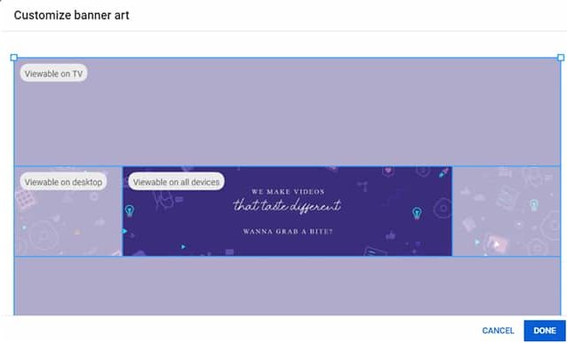
To ensure your YouTube banner size can fit properly on smaller screens, you need to take safe areas into account. Safe areas are the minimum dimensions needed to guarantee your banner will display correctly on even the smallest-sized devices, so the most important elements of your image (like your logo, catchphrase, or any part of it you deem essential) should stand within that safe area.
So, if you follow the standard YouTube banner dimensions of 2560 x 1440 px, your safe area will be 1235 x 338 px. Make good use of it!
How to Upload Your YouTube Banner
Once you’re all set up and you’ve made sure your YouTube banner size follows the guidelines, it’s time to upload it to your channel. Let’s go over this step-by-step, shall we?
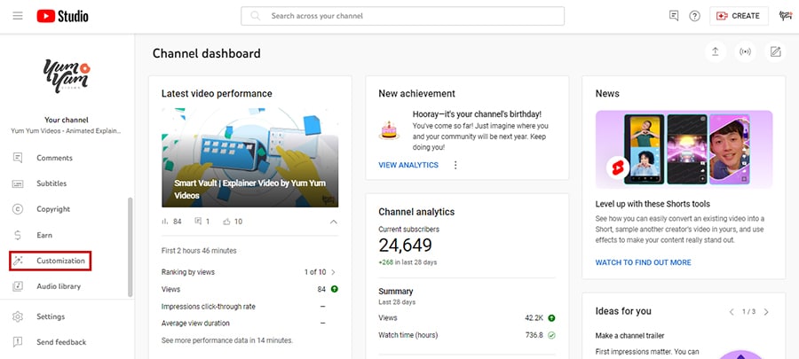
1. First, sign in to YouTube Studio, and click on the Customization button from the left menu.
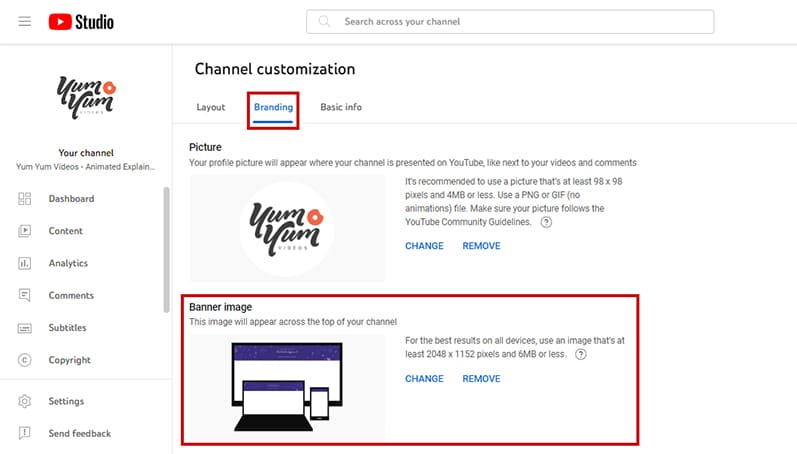
2. Next, go to Branding, and select Upload in the Banner section. You’ll also be able to upload your profile picture and video watermark within the Branding section, so you can revamp your channel all at once!
3. After you’ve uploaded your banner image, you’ll get a pop-up window where you can tweak and move the file within a template. This template tells you where your safe area is, marked with an All Devices tag, and what parts of your image are visible only on desktop and TV.
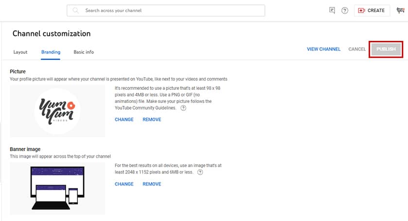
4. If you’re happy with how it looks, just click Done! Don’t forget to click on the Publish button on the top right corner of the page to save your work.
That’s it, you’re all finished! Your channel now boasts a beautiful banner image.
5 Great Examples of Banners for YouTube
Now that you’re acquainted with the ideal YouTube banner size and how to upload your very own, I think it would be nice to give you some examples of incredible banner images at work to see what all this theory looks like in practice 😉.
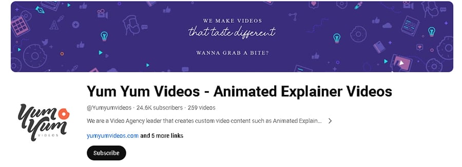
1. Yum Yum Videos
I know, I know. Starting the list off with our own channel might seem like the least humble thing imaginable! But I swear we deserve to be here, we’ve been doing this for over 12 years after all!
The image’s safe area focuses on some clearly readable text that has a high contrast against the background and features our taglines. This tells viewers right off the bat what we do in just three words while emphasizing what sets us apart from the rest.
Additionally, the purple background and the little drawings on the margins are our characteristic color and animation style, all of which reinforces our brand identity.
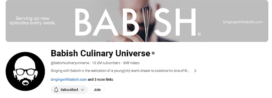
2. Binging with Babish
If someone out there knows a lot about branding, it’s definitely Andrew, from Binging with Babish.
Andrew’s culinary universe has grown a lot over the last few years, and he has managed to create a consistent and memorable brand image, clearly reflected in his YouTube banner.
The colors are neutral and the overall feeling of the image is calm and professional, just like his videos. He uses the safe area to include a nice hook for newcomers, Serving up new episodes every week, as well as highlighting his website. Not to mention, he features the beloved Tiny Whisk as part of his name!
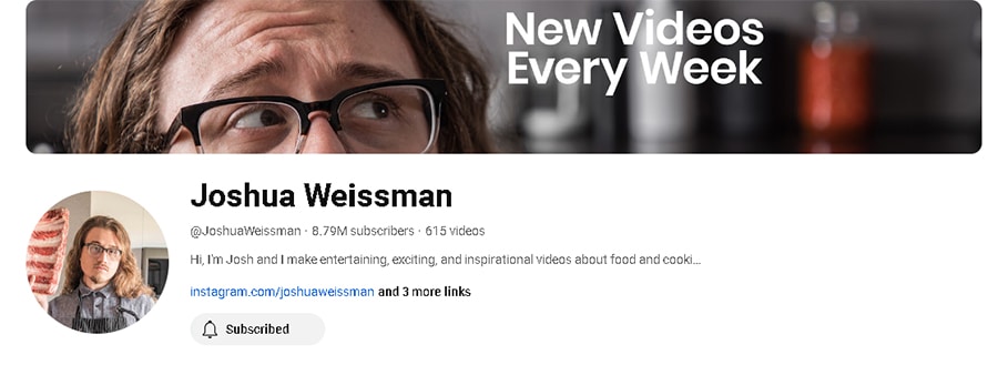
3. Joshua Weissman
Since we’re on the topic of food-related channels, let’s take a look at Joshua’s banner.
This time, although the channel’s subject matter is the same as with Binging with Babish (tasty and incredible recipes!), Joshua’s banner emphasizes only one thing: his uploading schedule. He knows his target audience wants new video content as soon as possible, so he chooses to highlight just that.
What’s more, Joshua’s videos feature him heavily —you’ll see his face just as much as the food. Using a close-up photo of himself as the banner is a fine choice, reinforcing the overall aesthetics we get from his videos.
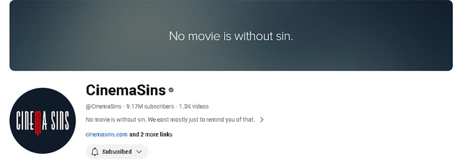
4. Cinema Sins
If you’re a movie fan like me, you’re probably acquainted with the viral Cinema Sins channel, where we can get some light-hearted banter about movie details and mistakes that might have flown over our heads.
With over 9 million subscribers, the team behind this channel knows that their formula is successful and speaks for itself, without any embellishments needed. They’ve amassed a huge following by pointing out movie sins, so their channel art conveys just that: no movie is without sin.
They’ve also done a great job regarding their color palette, cohesively tying their banner and logo together.
5. Nail Career Education
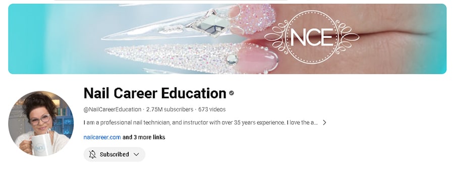
Okay, I’ll be the first to admit this example might be a bit of a niche, but bear with me for a moment. Suzie, the adorable middle-aged mastermind behind Nail Career Education, has been uploading videos about her work as a nail technician for almost a decade.
Suzie’s content focuses on anything and everything nail-related —from acrylics to gel, to nail art, to educational tips and advice for fellow technicians. While she’s a successful YouTuber, she’s still also a nail professional, so she doesn’t find it necessary to make her banner focus on anything else besides a picture of her work, accompanied by her logo.
What I love about this example is how you can clearly see what I’ve shared about YouTube banner size in full action: the safe area shows two nails and the channel’s logo, but on a bigger screen, you’d also see the full hand and the other nails Suzie crafted.
Wrapping Up
Well, that’s it for this little YouTube banner size masterclass! I hope you found it useful.
Knowing the ideal dimensions of YouTube banners isn’t the only thing you must take into account to get the most out of your channel customization. You should also put special emphasis on your brand design, creating channel art that accurately reflects your business and leaves a lasting impression on your viewers long after they’ve seen your banner and profile image for the first time.
Now that you’re all acquainted with the sizes and dimensions of your art, the next step is researching how to make a YouTube banner that’ll blow everyone’s socks off! I’m sure you’ll come up with something awesome 😄.
